Synapse
Service
SynapseFI is a banking platform that enables companies to provide financial products to their customers for a fraction of the cost of traditional banks.
Responsibilities
- Defined and structured Synapse's information architecture, design, and user experience.
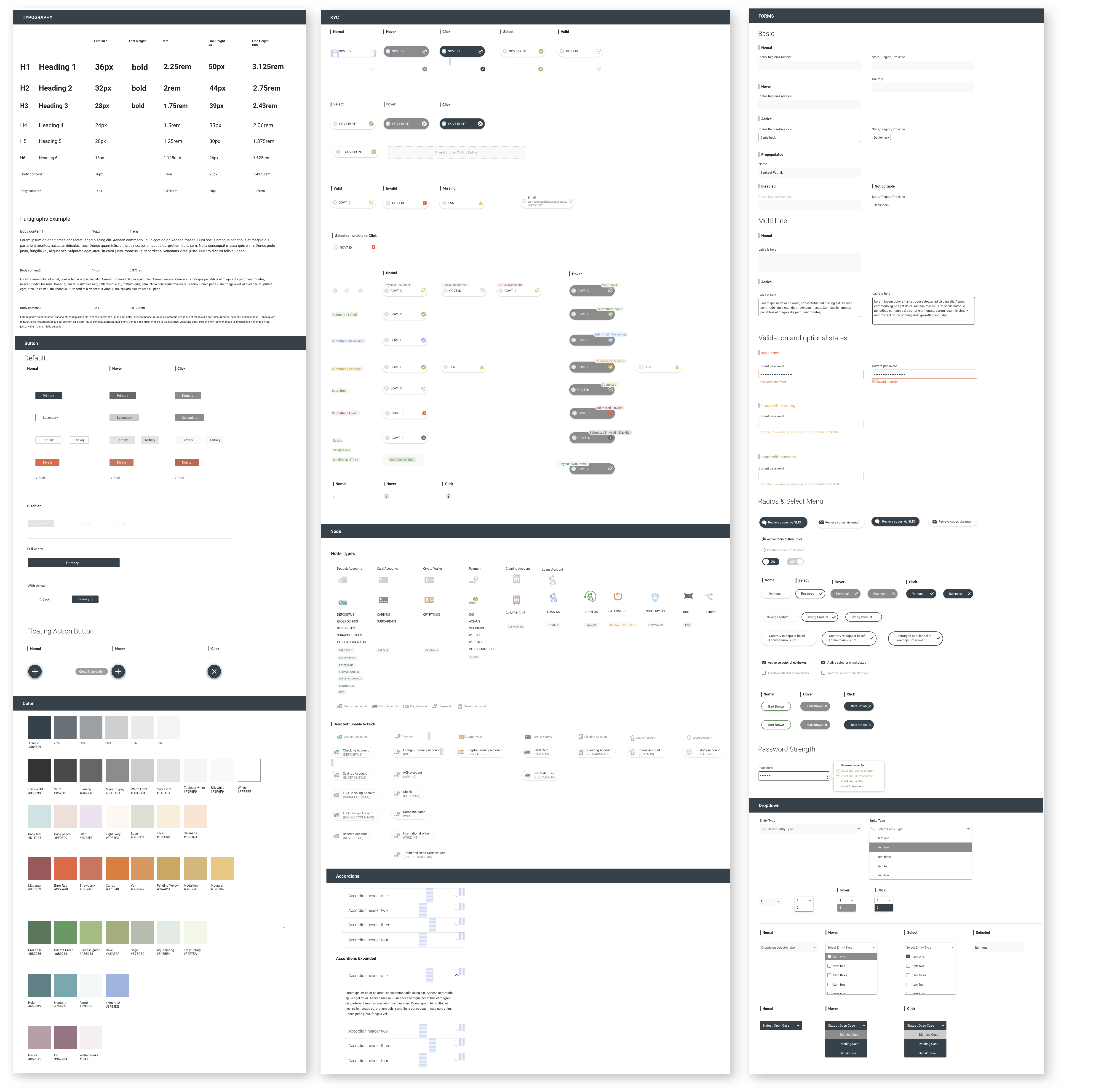
- Established and implemented creative and visual standards for Synapse's brand identity.
- Conducted extensive user testing to gather actionable feedback, analyze results, and identify areas for improvement.
- Leveraged user insights to refine the product strategy, enhancing functionality and usability based on feedback.
- Improved and proposed better information architecture from a UX design perspective.
- Empowered users with enhanced functionality, reduced support interactions, and designed an intuitive, user-friendly experience.
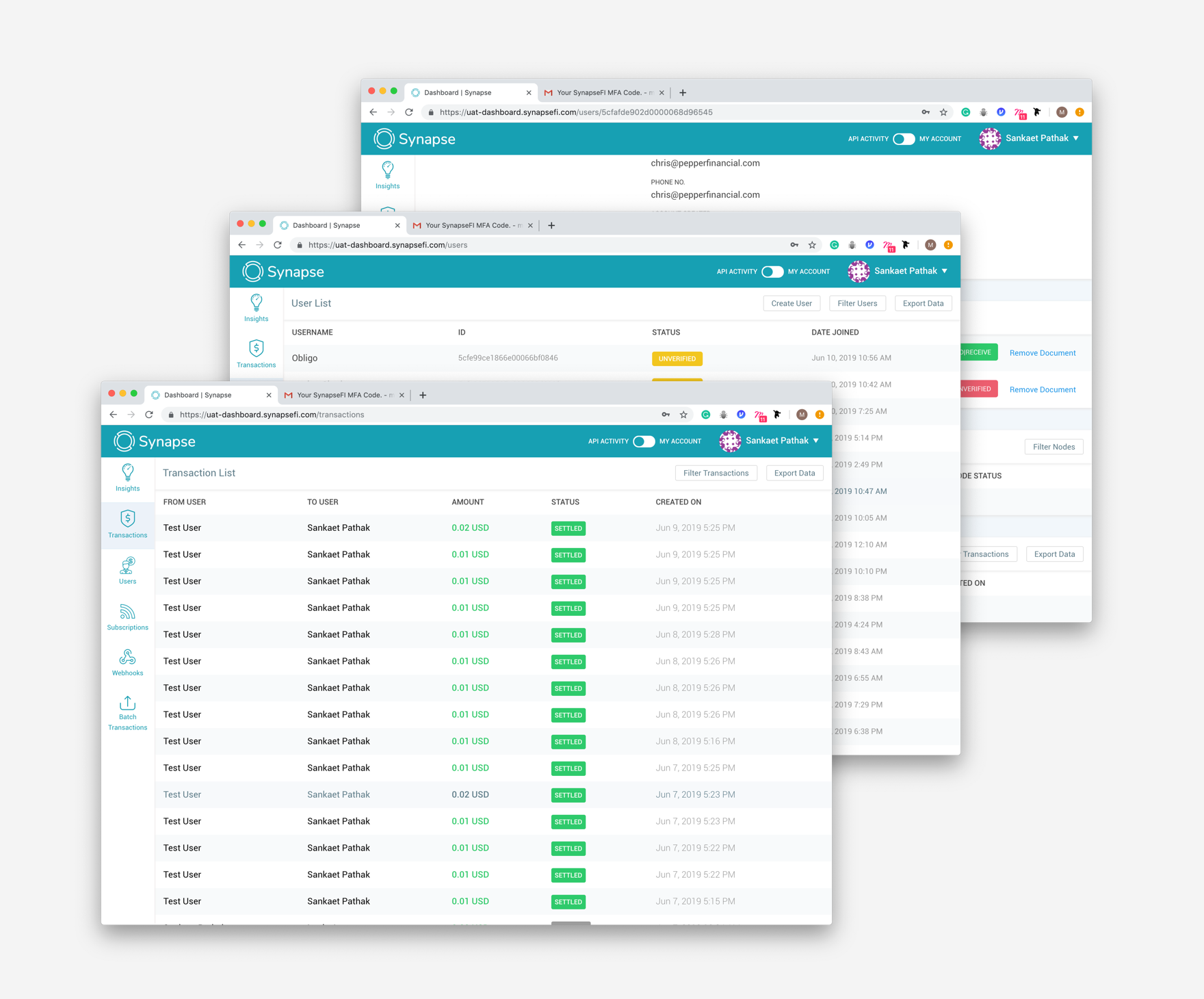
Client Dashboard : Before
Overall Problems
- Complex Navigation and Usability: The majority of participants reported that the development dashboard is challenging to navigate and use, frequently describing it as “confusing,” “unintuitive,” and “not user-friendly.”
- Hidden Key Functions: Many users expressed difficulty in locating important functions upon logging in, resulting in considerable time spent learning how to use the dashboard.
- Challenges for Infrequent Users: Users who access the dashboard infrequently struggle to understand available functionalities and capabilities.
- Inconsistent Functionality: Certain features, such as the “never log me out” button and batch transactions, do not operate as expected.
- Labeling and Language Issues: The dashboard suffers from poor labeling and unclear language, which hinders effective user interaction and understanding.
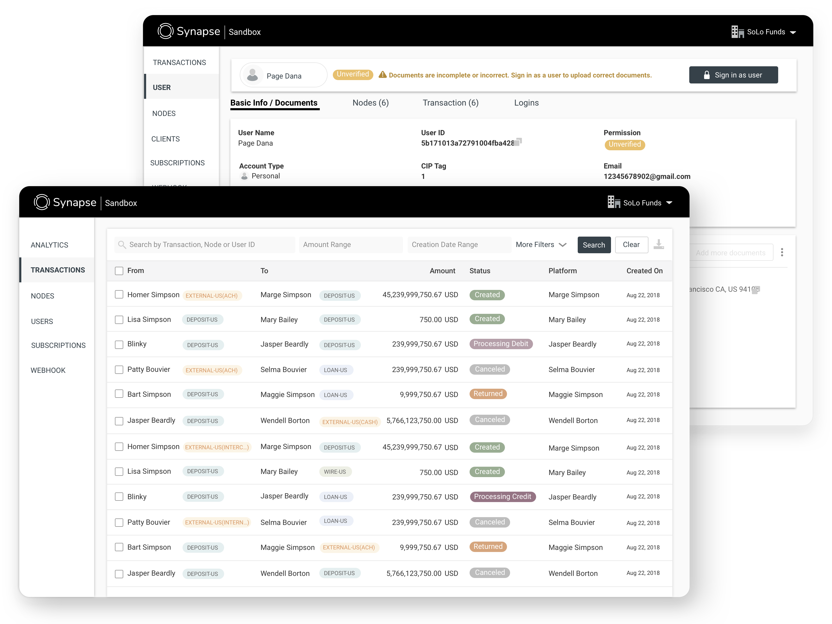
Client Dashboard : After
Improvements Direction
- Enhance User Autonomy: Empower users with greater functionality and the ability to complete tasks independently.
- Reduce Support Inquiries: Minimize the volume of help tickets and Slack messages received by improving self-service options.
- Improve Usability: Create a more intuitive and user-friendly experience to facilitate easier use.
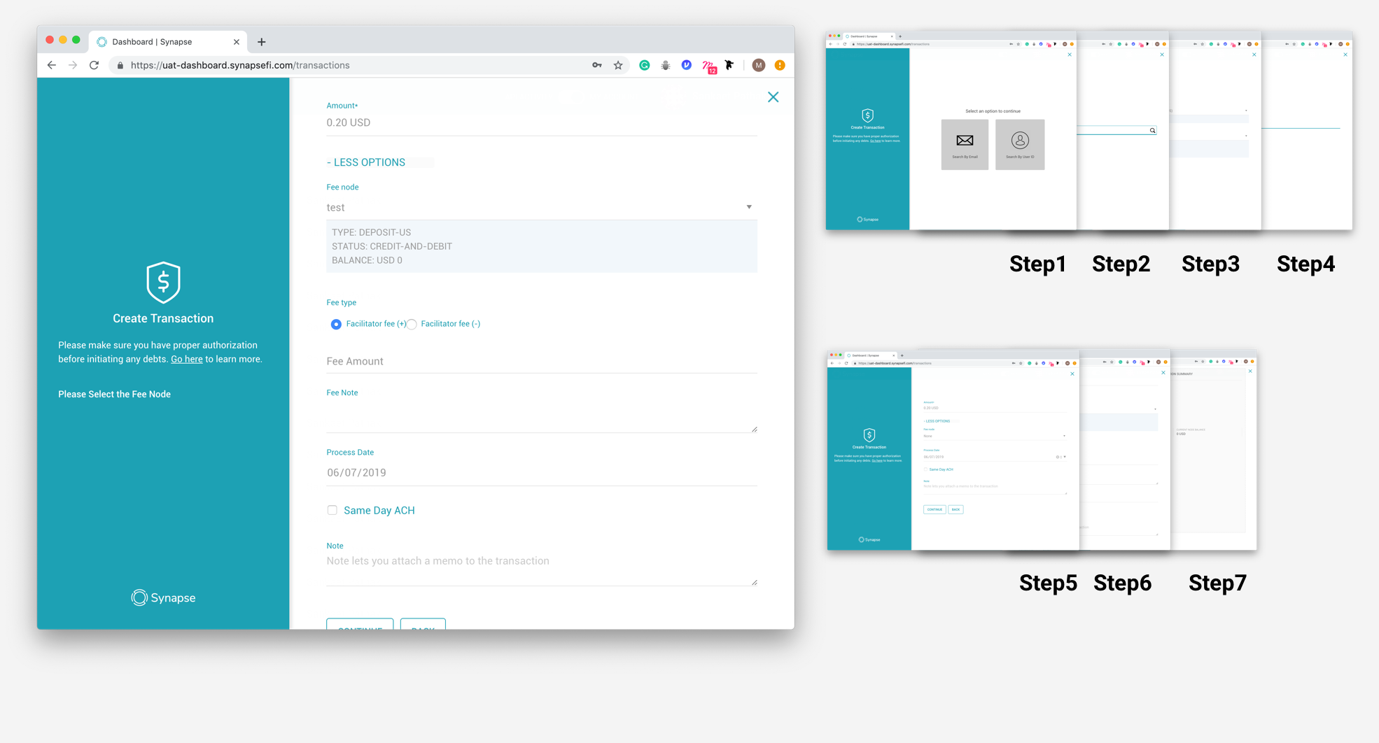
Create Transaction : Before
Overall Problems
- Complex and Lengthy Process: The current workflow is long and confusing for users.
- Unclear Fee Responsibility: It is difficult to determine who is responsible for covering the transaction fees.
- Uncertainty in Fee Amount: Users find it challenging to ascertain the exact transaction fee amount.
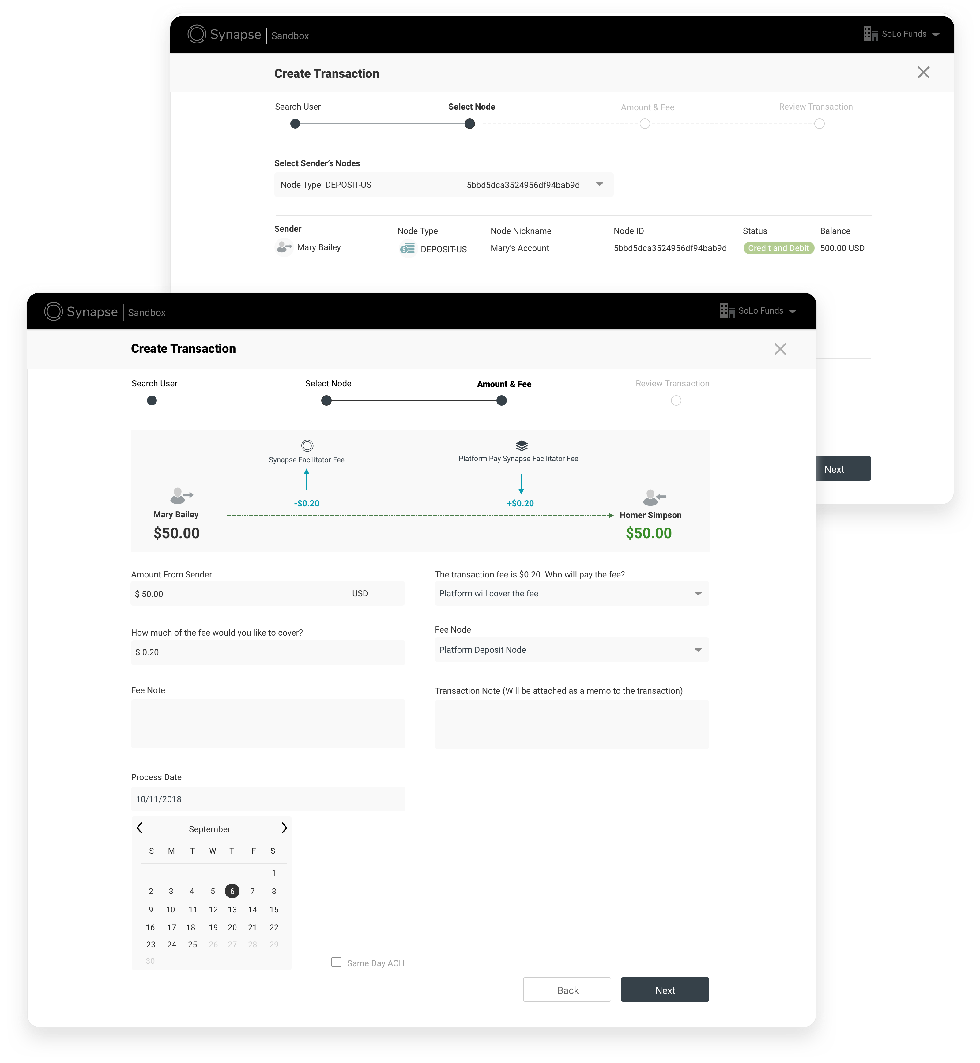
Create Transaction : After
Improvements Direction
- Simplify the Workflow: Streamline the process by reducing steps and incorporating clear, step-by-step guidance to enhance user understanding and ease of use.
- Transparent Fee Information: Implement a clear breakdown of transaction fees at the point of transaction, showing who is responsible for the fees.
- Real-Time Fee Calculation: Provide real-time calculations of fees before the transaction is completed to eliminate uncertainty and improve transparency.
- Intuitive Design Enhancements: Use visual aids and clear labeling to make the interface more intuitive, helping users navigate the process more easily.
- Interactive Help Features: Integrate tooltips, FAQs, and live support options to assist users throughout the transaction process, reducing confusion and support inquiries.
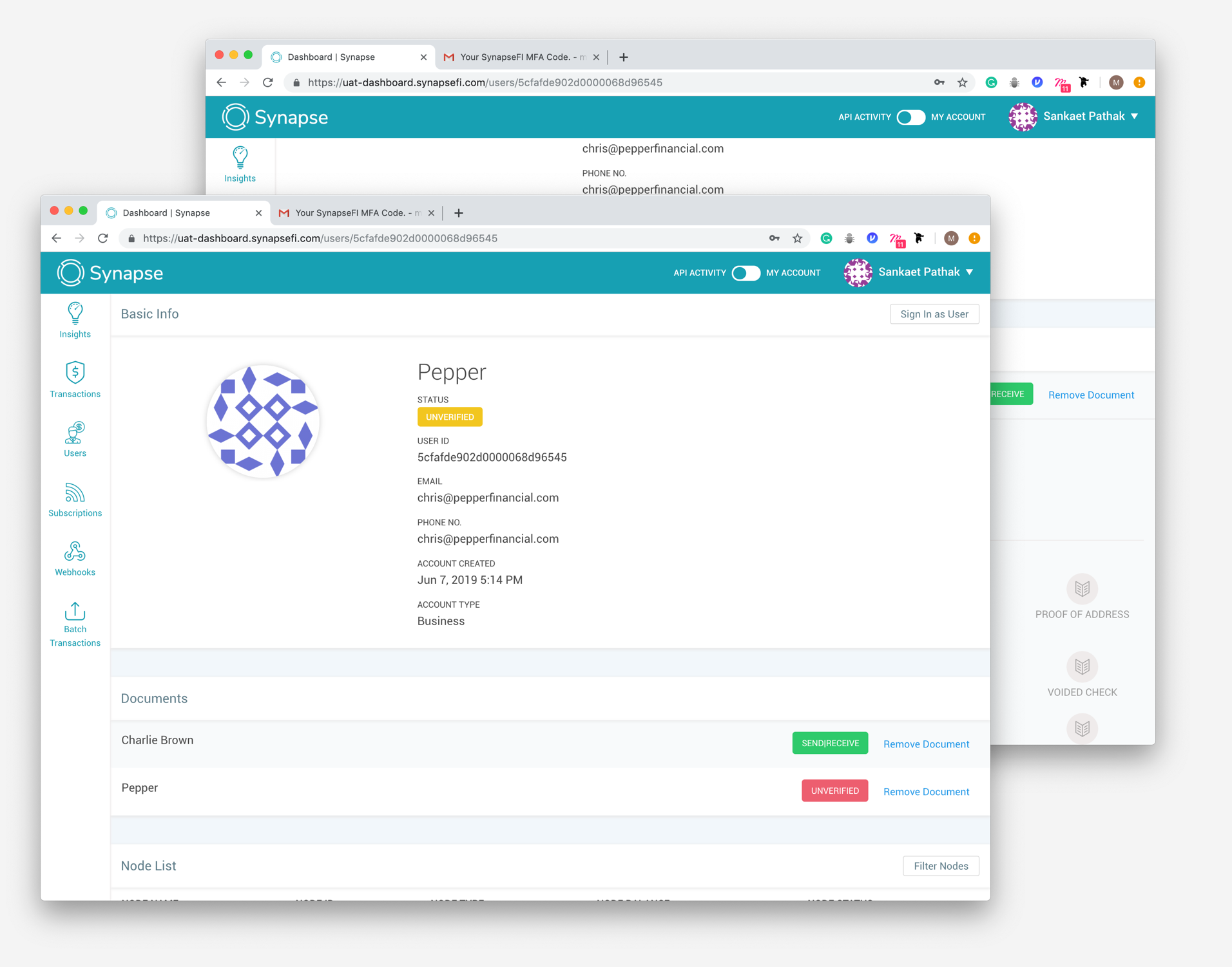
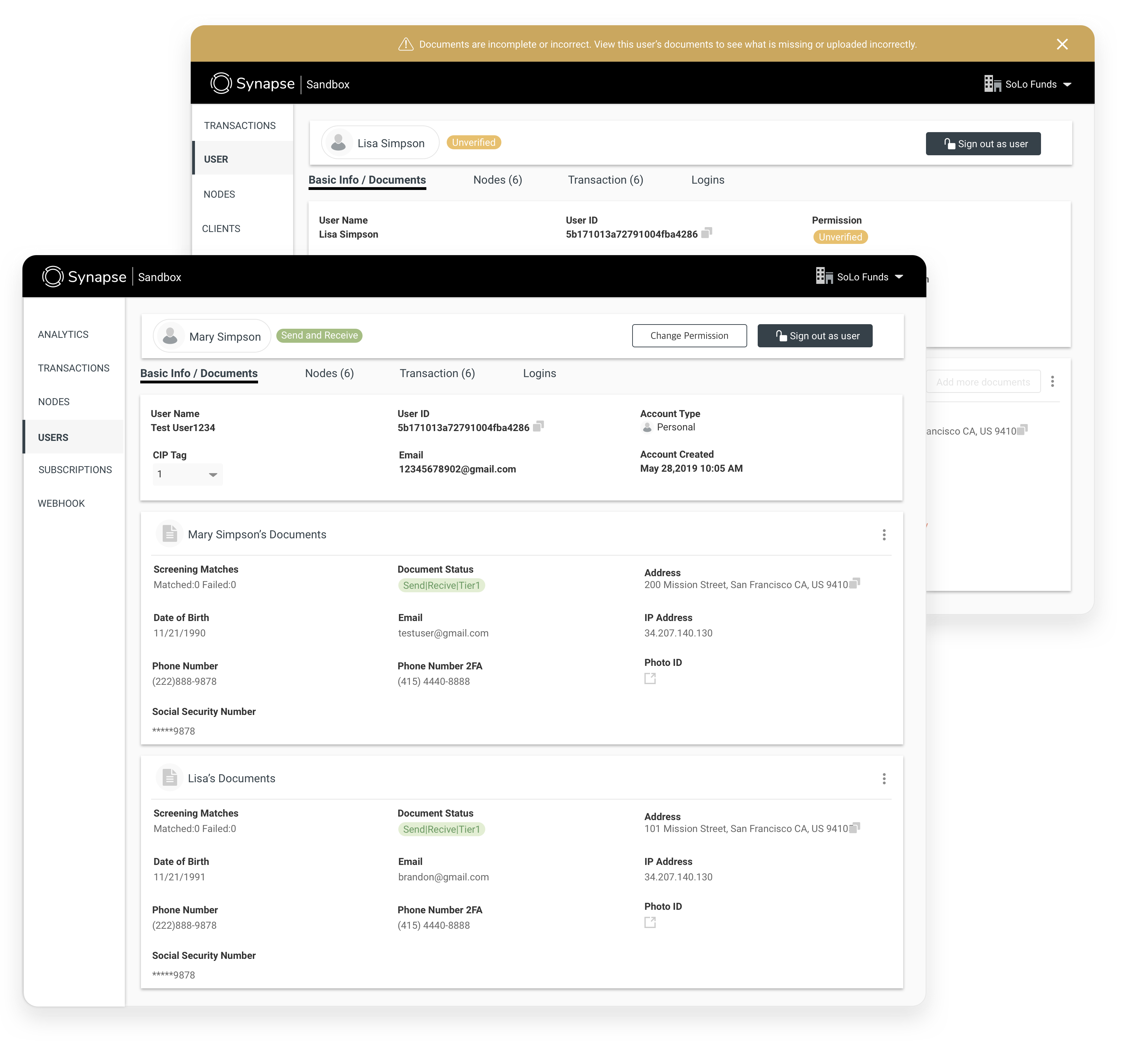
Dashboard-User Detail : Before
Overall Problems
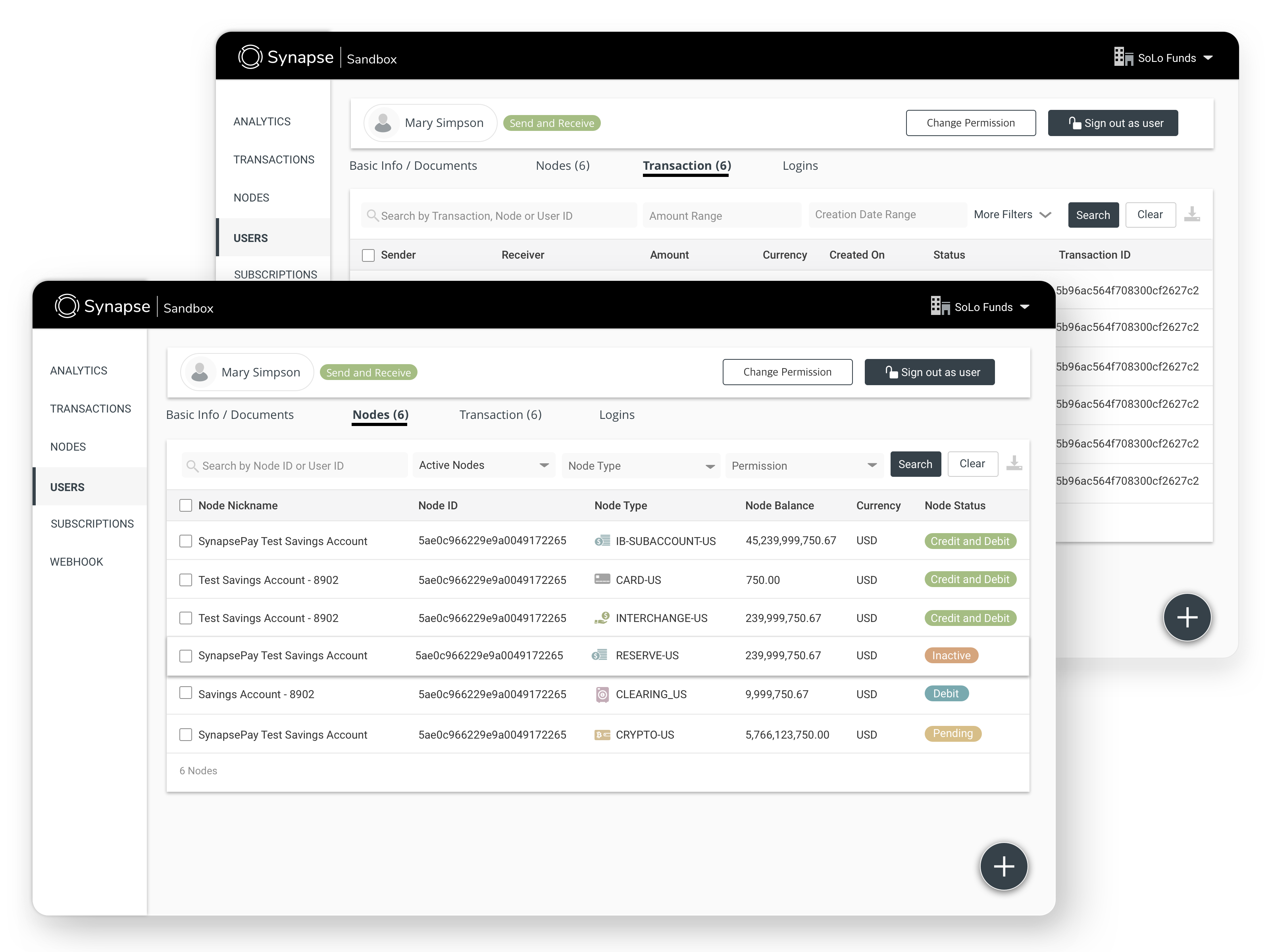
- User Node Visibility: Users must scroll extensively to locate their node, making it difficult to identify at a glance.
- KYC Issue Identification: Users struggle to identify which KYC (Know Your Customer) requirements are missing and lack clear guidance on resolving these issues.
- Confusing Verification Indicators: The green and red circles used to indicate document verification status can be confusing, especially when documents are verified but not required for KYC.
- Document Verification Clarity: Users find it challenging to determine which documents are not verified and the reasons for their non-verification.
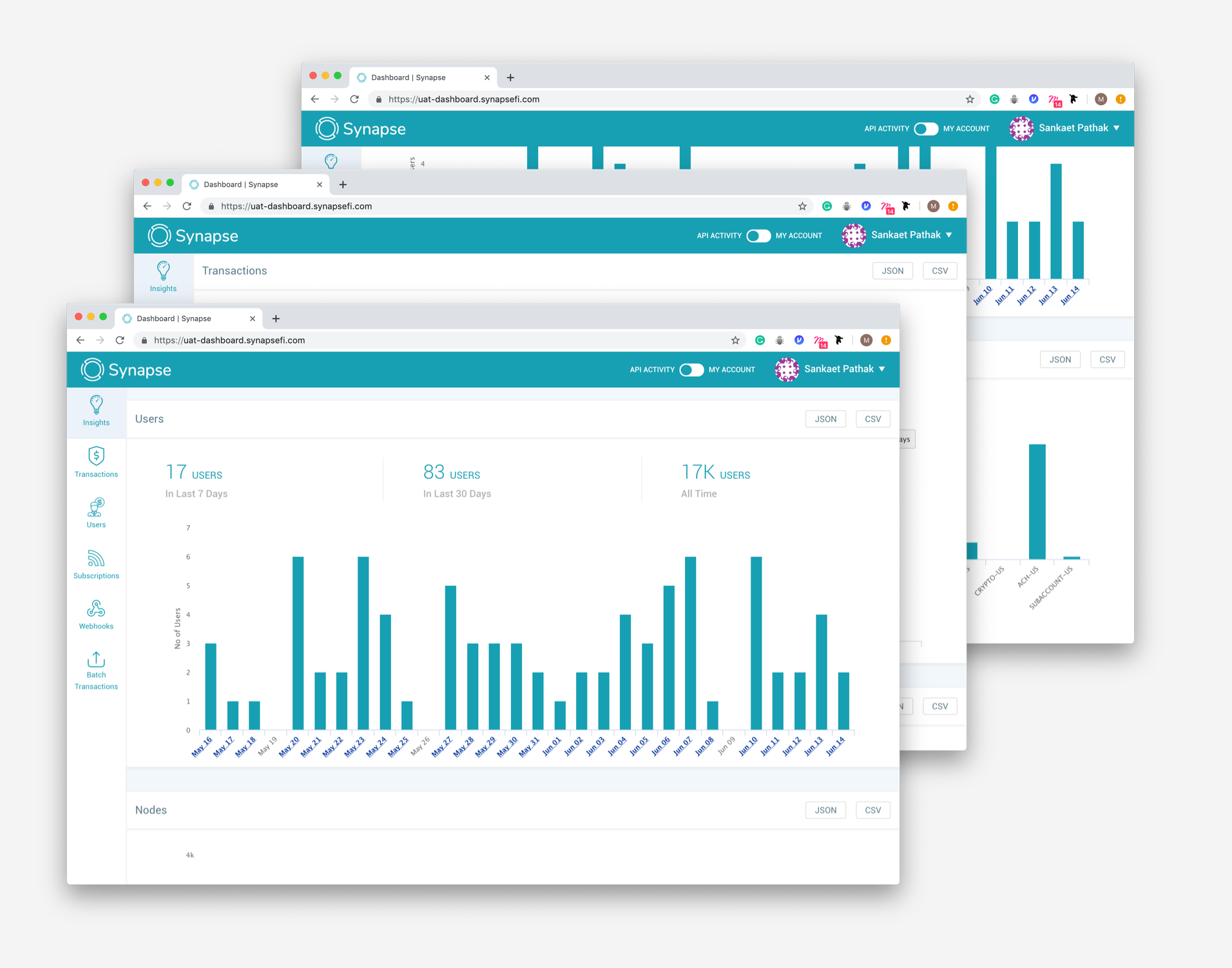
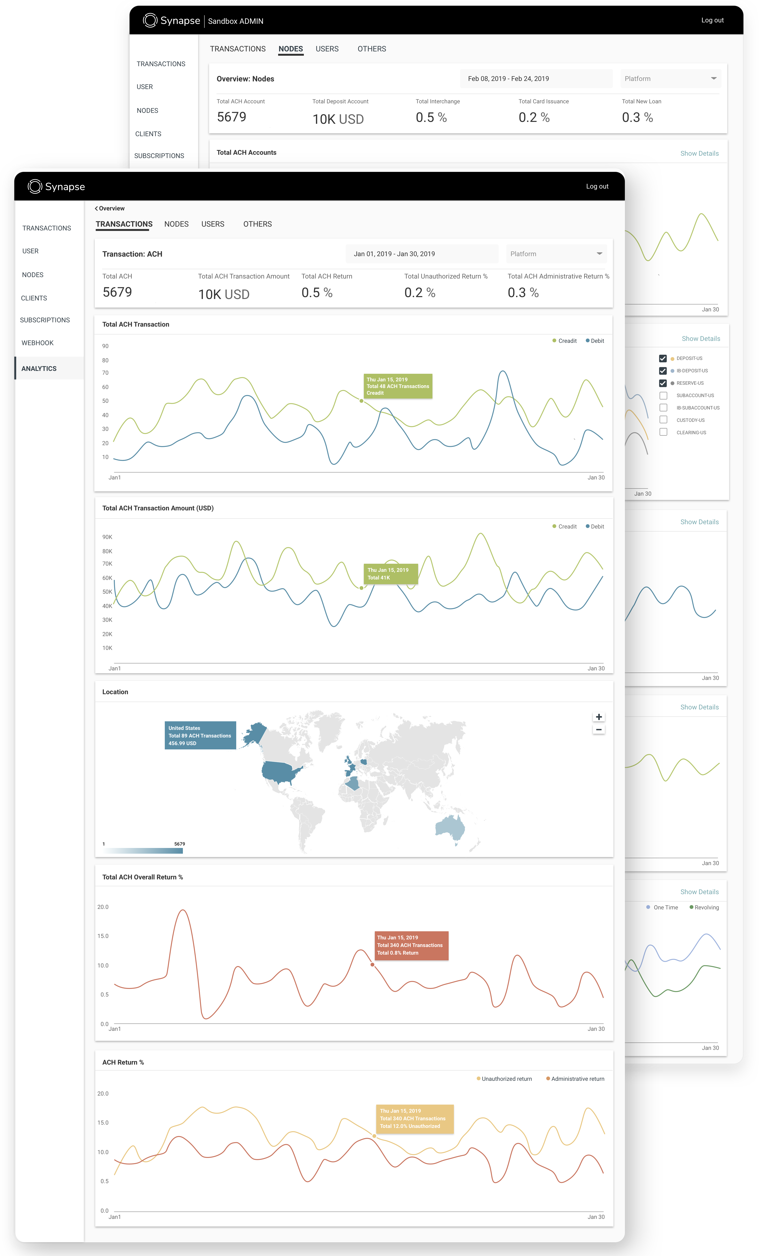
Analytics : Before
Overall Problems
- API Request Response Times: Complicated information architecture for API usage.
- Node Balances: Indirect access and visualization of node balance information.
- Transaction Volume Analysis: Insufficient data on transaction volumes, particularly for long-term trends beyond the past 30 days.
- User Verification Status: Unclear distinction between verified and unverified users.
Analytics : After
Improvements Direction
- Simplify the information architecture for API usage by organizing and categorizing API calls more intuitively.
- Design a more direct and user-friendly interface for accessing and visualizing node balance information.
- Enhance data visualization tools to provide comprehensive insights into transaction volumes, including long-term trends.
- Improve the user interface to clearly differentiate between verified and unverified users through distinct visual indicators.
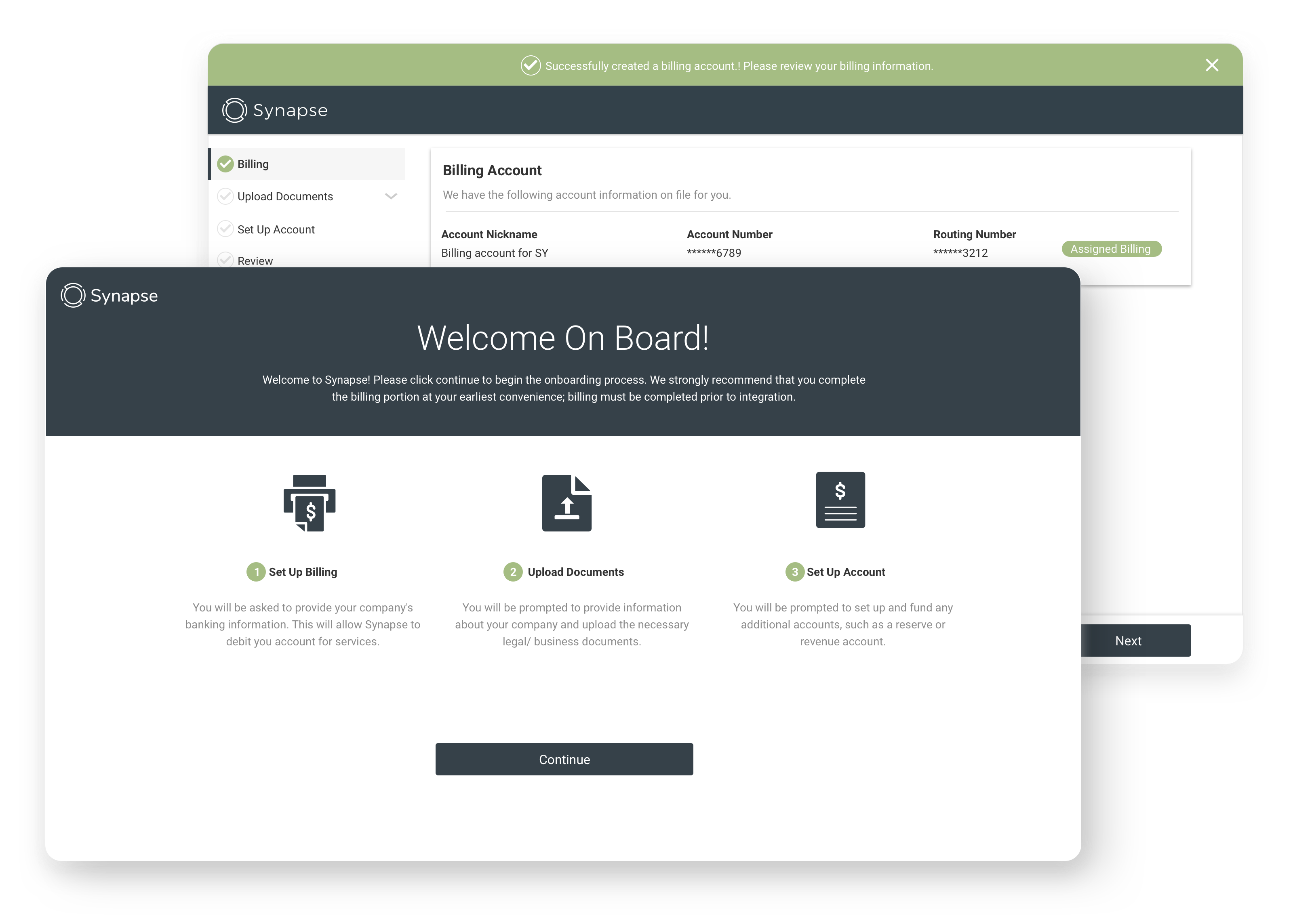
New Client Onboarding : New Feature
UX Directions
- Empower User Autonomy: Enhance user functionality to enable more self-service capabilities.
- Minimize Support Interactions: Implement solutions to decrease help tickets and Slack inquiries.
- Enhance Usability: Design an intuitive and user-friendly experience.
